Publishing your own photobook is the culmination of the creative journey for any photographer. It’s not just a collection of shots, but a carefully curated, tactile story that lives beyond the fleeting digital space. In an era when thousands of images are scrolled through in minutes on social media, a photobook remains a weighty, tangible artifact that solidifies your vision and legacy.
The resource bur4ik.ru has prepared a comprehensive guide to help you navigate the path from the initial idea to receiving your finished print run. This process requires discipline, technical literacy, and, most importantly, a clear understanding of the story you want to tell.
1. Photobook: why is it cooler than just publishing online?

A photobook has unique qualities that cannot be replicated on a screen. It transforms a set of individual frames into a cohesive, sequential narrative where each shot enhances the previous one.
- Physical Durability: A book won’t disappear when a social media algorithm changes or a hosting service shuts down. It becomes part of your personal library or collection.
- Presentation Control: You have complete control over the size, order, print quality, and paper type. This allows for precise emotional and visual impact.
- Tactile Experience: The feel of the paper, the smell of the ink, the weight of the book in your hands – all add a depth of perception unavailable to digital media.
- Project Completion: Publishing a book serves as a powerful psychological closure to a long-term photo project, transitioning it from a « work in progress » to a finished work of art.
2. Stage 1: Concept and Photo Selection – The Story You Will Tell
The most challenging part is transitioning from « favorite photos » to « a story for the book. » A photobook needs a clear structure and a unified voice. Start by defining the central concept (monograph, documentary project, portfolio).
Developing the Concept
Before selecting your shots, answer these key questions:
- What is the main theme? (e.g., life in a specific city, an exploration of loneliness, a series of abstract still lifes).
- Who is the target audience? (Collectors, fellow photographers, the general public).
- What is the emotional tone? (Light, melancholic, aggressive).
The Hard Edit
The selection process must be ruthless. Experts recommend setting aside the shots for a few weeks and then reviewing them with fresh eyes. If you’re unsure about a shot, it’s probably not needed.
Rules for selecting shots for the book:
- Avoid duplication: If two shots convey the same idea or emotion, choose the better one.
- Focus on the narrative: A shot should advance the story, not just be a beautiful image.
- Work with rhythm: Mix strong, « anchor » shots with calmer, transitional ones. This creates a visual rhythm.
- Involve an editor: If possible, show your draft selection to someone you trust but who is unfamiliar with the project. An outside perspective is invaluable.
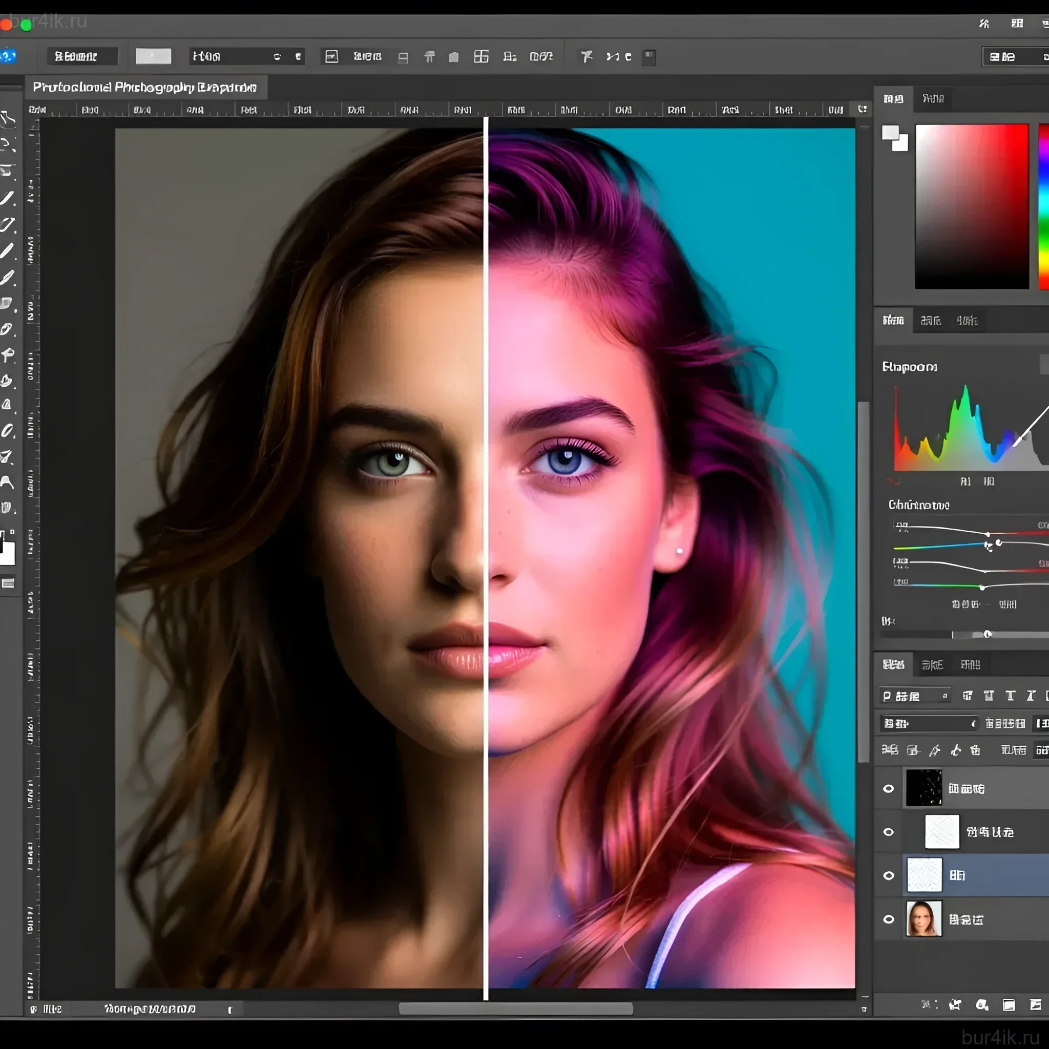
3. Stage 2: Editing and Processing Photos for Print – Preparing Images for Their Best Appearance

Processing for a digital screen and processing for print are two entirely different tasks. Images can lose saturation, shadow detail, and overall brightness when printed. Special preparation is required.
Technical File Requirements
- Resolution (DPI): High-quality printing requires a minimum of 300 dots per inch (DPI) at the final print size. Insufficient resolution will lead to pixelation.
- Color Space: Most professional printing houses work in the CMYK color space, but they often prefer photographers to provide files in Adobe RGB (1998) or even sRGB (if required by a specific PoD service), and they will perform the conversion to CMYK themselves using their own profiles. Always clarify this with the printing house.
- Color Depth: 8-bit files (JPEG, TIFF) are recommended.
- Sharpening: Apply « print sharpening. » It should be more aggressive than screen sharpening, as ink and paper slightly soften the image.
Basics of Soft Proofing
Soft proofing is a simulation of how an image will look when printed, taking into account the profile of a specific printing house and paper. Use this feature in programs like Adobe Photoshop to adjust shadows and highlights that might « fall apart » in print beforehand.
4. Stage 3: Choosing Format, Paper, and Cover – Creating Tactile Sensations
The physical characteristics of a book – its size, weight, and texture – are an integral part of the story. The choice of format and materials depends on the genre of your book.
Format and Orientation
- Square: Ideal for Instagram projects or stylized portraits.
- Landscape: The best choice for landscapes, panoramas, and cinematic scenes.
- Portrait: A classic choice for monographs and reportage. Standard sizes: A4 (210×297 mm) or similar.
Binding Types
The binding determines how the book opens and how durable it will be:
- Perfect Binding: The most budget-friendly option. Suitable for books that don’t require full opening.
- Smyth Sewn: The standard for quality publications. Very durable, allows the book to lie relatively flat.
- Lay-Flat: Ideal for photobooks where shots span a full spread. Expensive, but provides the best visual continuity.
Paper Selection
Paper affects color reproduction, contrast, and tactile feel. Weight is measured in grams per square meter (gsm). For photobooks, 150–250 gsm is typically used.
Comparison of popular paper types:
(Note: Names may vary depending on the printing house)
- Glossy Coated: High saturation, maximum detail, but prone to glare. Ideal for vibrant color photography.
- Matte Coated: Less glare, deeper blacks. Preferred for portraits and black-and-white photography.
- Uncoated: Textured, absorbs more ink. Gives shots an « artistic, » muted look. Excellent for art publications.
5. Stage 4: Photobook Design and Layout – Telling the Story Visually
Layout is the architecture of your book. It determines how the viewer interacts with your images and how the narrative unfolds. The design should be a servant to the photography, not its competitor.
Layout Tools
- Adobe InDesign: The professional standard. Allows precise control over layout, fonts, margins, and file export for the printer.
- PoD Service Software (Blurb, Lulu): User-friendly for beginners, with ready-made templates, but limited in flexibility.
Key Layout Principles
- Grid and Margins: Establish a strict grid. Margins should be not only aesthetic but also functional. Consider the inner margin (gutter) that will be « eaten » by the binding.
- White Space (Negative Space): Don’t be afraid of emptiness. White space allows shots to « breathe » and focuses the reader’s attention. Sometimes one small, but strong shot on a spread makes a greater impact than two large ones.
- Rhythm and Pace: Vary the pace. Alternate spreads with a single large image, spreads with a collage of several shots, and spreads with text. The beginning and end of the book should be strong.
- Fonts: Choose one or two clean, readable fonts. Text (if any) should not distract from the visual content.
Expert tip: Print out reduced copies of all pages (thumbnails) and lay them out on the floor. This will allow you to see the rhythm of the entire book as a whole, not page by page.
6. Stage 5: Choosing a Printer and Printing – From Digital to Reality
Choosing a printing partner is a critical step that determines the final result. The main decision is whether to use Print on Demand (PoD) services or opt for a traditional offset printing house.
Comparison of Printing Methods
- Print on Demand (PoD):
- Pros: No minimum print run, low startup capital, fast turnaround.
- Cons: Limited choice of paper and binding, quality may be lower than offset, high cost per unit.
- Suitable for: Test runs, personal gifts, small series (up to 50-100 copies).
- Offset Printing:
- Pros: Maximum quality control, accurate color reproduction, ability to use non-standard materials, low cost per unit for large runs.
- Cons: High minimum print run (from 250-500 copies), large startup capital, long production times.
- Suitable for: Professional publications, commercial sales, large runs.
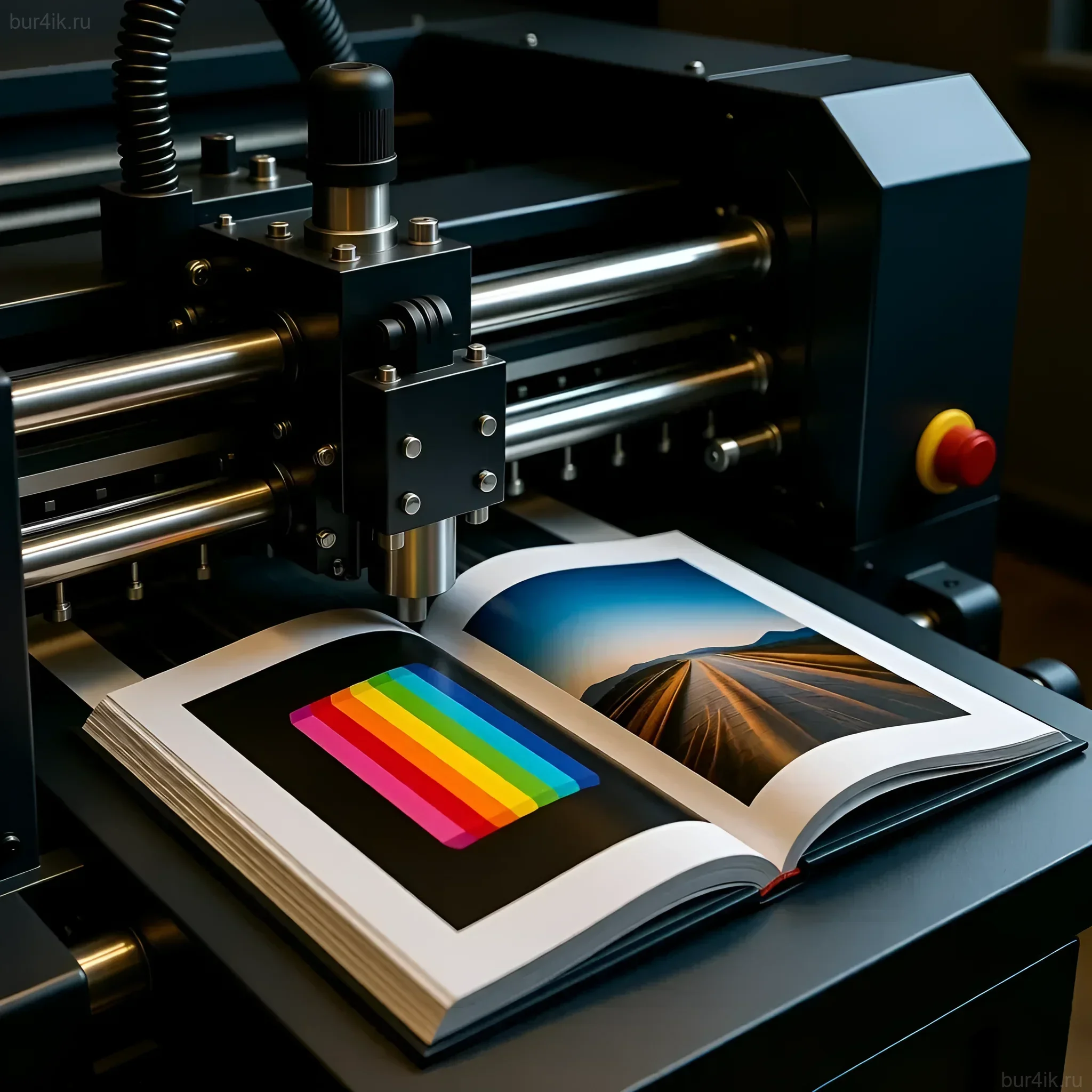
Test Print
Never order the entire print run without a preliminary test print or at least a color proof. A test print allows you to see how colors, contrast, and detail behave on the chosen paper. This is the last chance to make adjustments to the files or layout settings.
What to check in a test print:
- Color accuracy (especially skin tones and deep blacks).
- Detail in the brightest and darkest areas (have the shadows « fallen apart »).
- Correct cropping and centering (ensure text and important parts of shots are not in the bleed area).
7. Stage 6: FAQ – Answers to Frequently Asked Questions About Publishing Photobooks

Do I need an ISBN?
If you plan to sell the book through bookstores, distributors, or large online platforms, an ISBN (International Standard Book Number) is necessary. If it’s a personal project or a small run for friends, an ISBN is not required.
How much does it cost to publish a first photobook?
The cost varies greatly. Using PoD services, one copy can cost from $20 to $80 (depending on format and paper). Offset printing can require an investment of $3,000 to $10,000 for a run of 500 copies, but the cost per unit will be significantly lower.
How do I protect the copyright of the shots in the book?
The act of publishing the book is already a form of copyright registration. Be sure to include the copyright symbol on the title page or at the end of the book: © [Ваше Имя] [Год издания]. All rights reserved.
How do I organize sales and distribution?
For small runs, the best method is direct sales through your personal website, social media, and photo fairs. For large runs, you’ll need to sign a contract with a book distributor who will handle logistics and placement in stores.
8. Interesting Facts and Inspiration – Stories of Successful Photobooks
The history of photography is inseparable from the history of the photobook. Many iconic projects gained recognition precisely through the print format.
- « The Americans » by Robert Frank (1959): This book completely changed the perception of documentary photography. Its success was due not only to its revolutionary shots but also to its bold, minimalist layout, which emphasized the alienation and loneliness of American society.
- « William Eggleston’s Guide » (1976): This book, published by the Museum of Modern Art (MoMA), established color photography as a form of high art. Its success showed that even the most ordinary-seeming shots can become monumental if presented as a carefully structured publication.
- « Ray’s a Laugh » by Richard Billingham (1996): A book that demonstrated how personal, intimate, and sometimes shocking family stories can be packaged in the format of an art book, evoking a strong emotional resonance.
Publishing your first photobook is a marathon that requires attention to detail at every stage: from choosing the concept to checking the color proof. However, the result – a tangible work that lives its own life – fully justifies the effort. The resource bur4ik.ru wishes you success in creating your first masterpiece.